|
In this assignment, I created many different logos and words which I think represents my brand. For this assignment, I created a company called Daedalus Enterprises. This company is a software company which creates artificial intelligence. When I made the company, what I had in mind was that it would be a minimalistic, modern, and smart company. This is why my logos represent that. My first logo is a hand which looks like a circuit board. It represents the unity of AI and humans in a utopian society. The second one is three stacks progressively getting taller, symbolizing the growth of humanity through AI. The last one is a machine learning network of trial and error, which represents the way AI's learn. I think that all of my logos represent my company's branding very well. 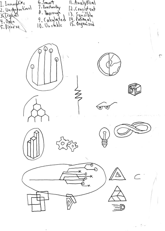
0 Comments
For this assignment, I was tasked with creating 20 shapes, 5 for each of 4 color palette formats. To get my color palettes, I went to the adobe color wheel. I was surprised by just how many different colors and combinations of colors you could have just by selecting a certain palettes. The first format was monochromatic, which is a palette where all colors are a different shade of the same color. The second was analogous which is where all the colors are next to each other on the color wheel. The third palette was triadic, where all colors trisect the middle of the color wheel. The last palette was complementary where there are multiple shades of two colors. Some formats I liked better than others, such as the complementary format, because it only had two general colors which gave it a sense of simplicity. Others I didn't like, like the triadic one. It felt like it was all over the place and had no sense of unity. From this assignment, I learned that there are many colors combinations, but some go better with each other than others. To make these palettes, I used adobe color wheel. 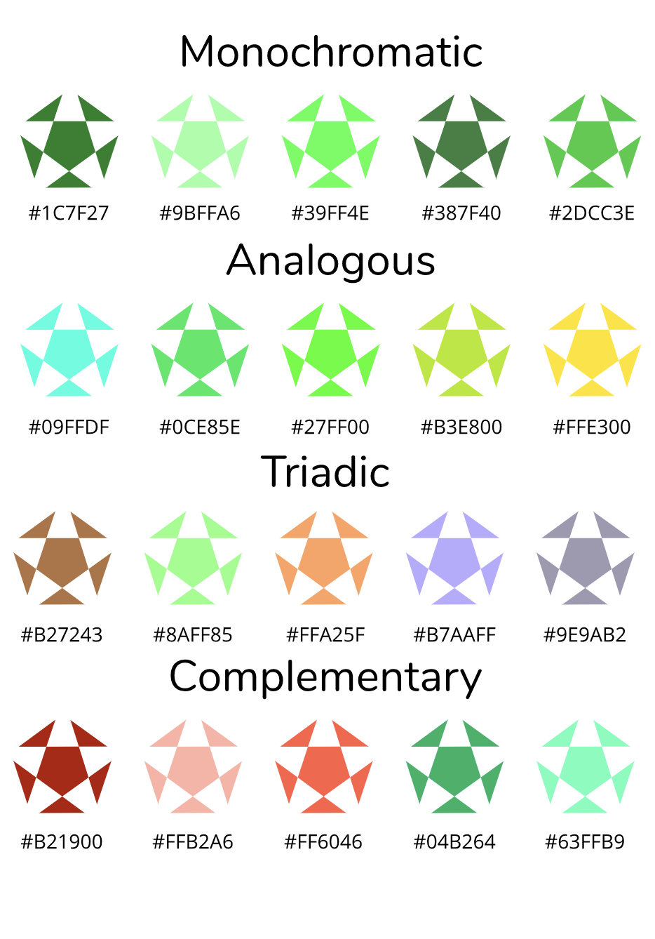 |
Categories
All
Archives
May 2019
 This work is licensed under a Creative Commons Attribution-NonCommercial-ShareAlike 4.0 International License. |
