|
In this lesson, I learned how to link websites with HTML. It was actually easier than I expected it to be, because I was already prepared for this lesson to come up. Many websites take you to new websites, so I knew that I would be learning how to link eventually. It's great to finally know how to do this. 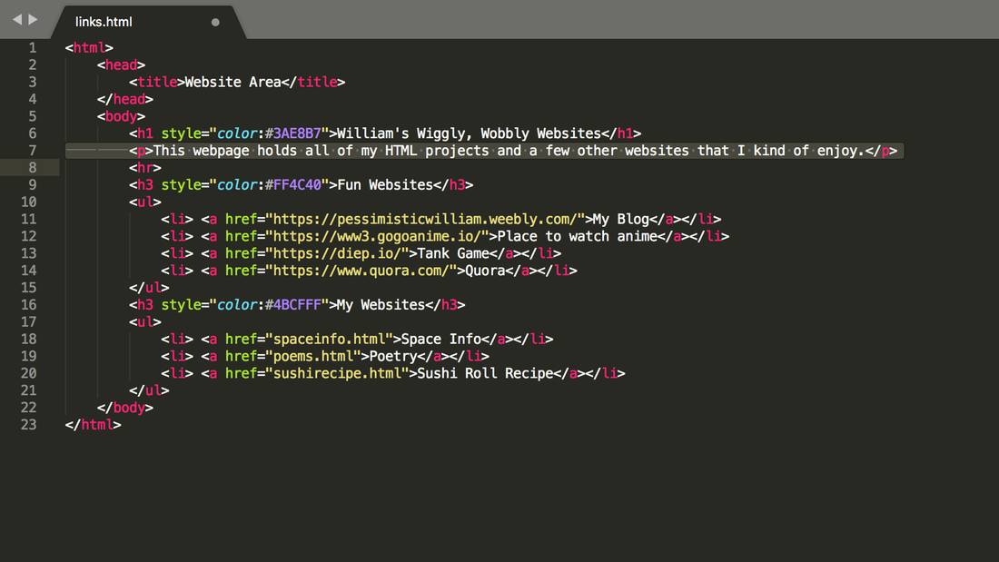 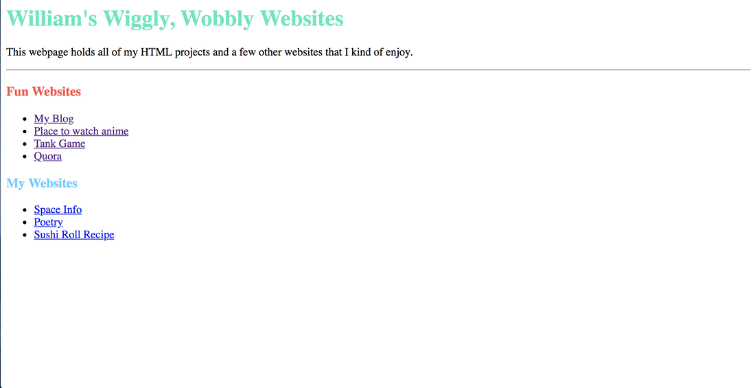
0 Comments
This time, I used a numbered and bulleted list to create a recipe for sushi. Researching for the recipe was fun and I like how HTML lets you choose between two lists. 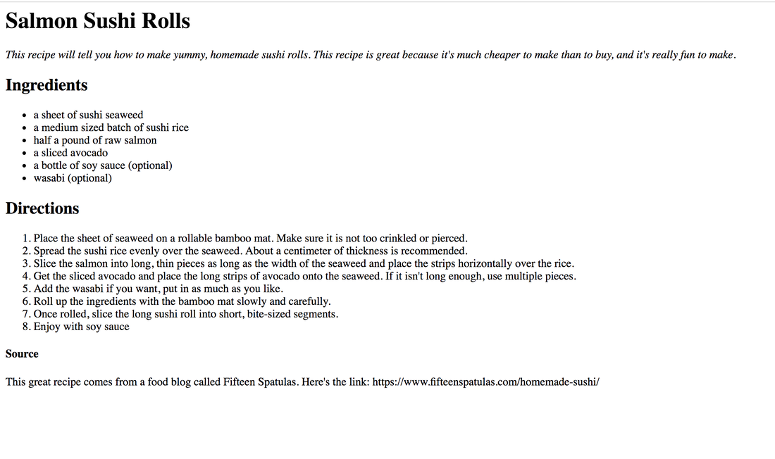 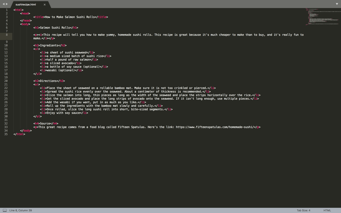 On this assignment, I made three poems while using newly learned html elements such as bold tags, italic tags, the line break tag and the horizontal rule tag. These new elements came in very handy, especially for organizing different ideas. I also had tons of fun making the poems. 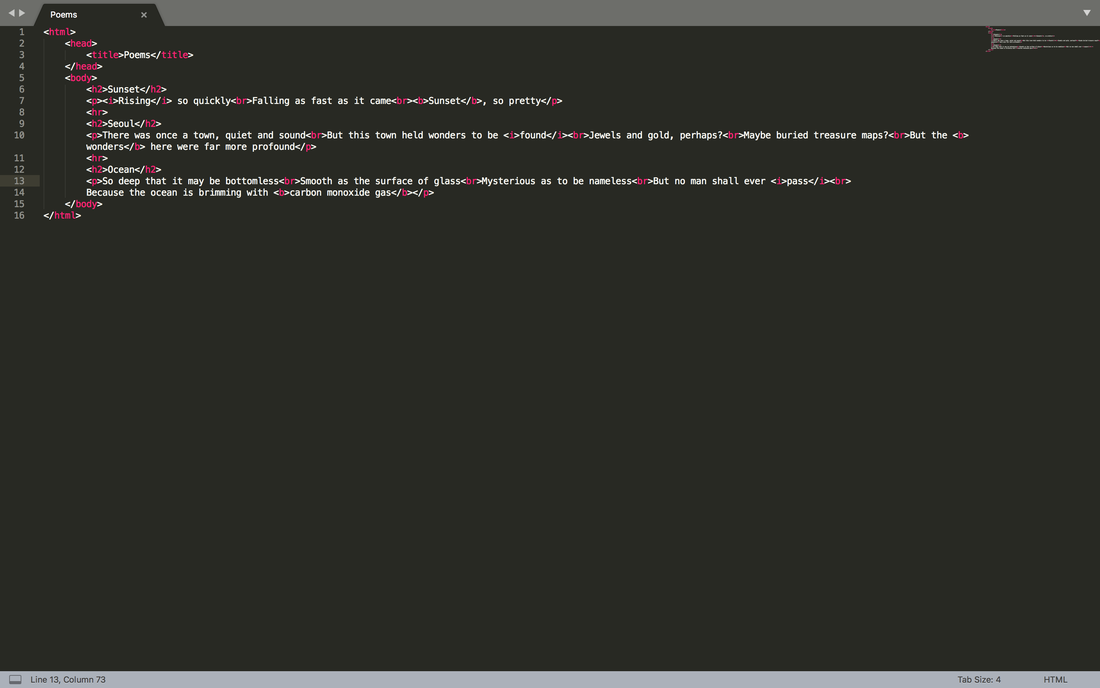 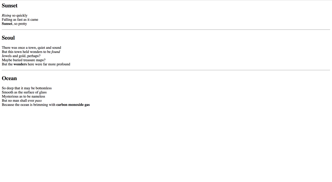 For the first time, I used HTML today. I already kind of knew what HTML was, but I didn't think that it would be so easy to use. It's really convenient for creating beginner websites and I think that I'll remember how to use it in my future. I created my own web page using HTML code. The one thing that I don't like about it though is that the font is weird and tacky.   In this part of my logo design process, I vectorized my three logos and made two new variations for each of them. This part of the design process was quite challenging because I had to layer every single layer and polygon properly to make the design look right, which took a long time and I failed a few times. My favorite part about creating the three variations was surprising myself with how I could improve on the logos. I thought that I had already created the ideal logos, but I managed to do better. Something that I learned from this experience is that creating variations, or any type of creative modification to your original design can give you new ideas without you even knowing it, so always throw in something extra just in case it might improve your design. 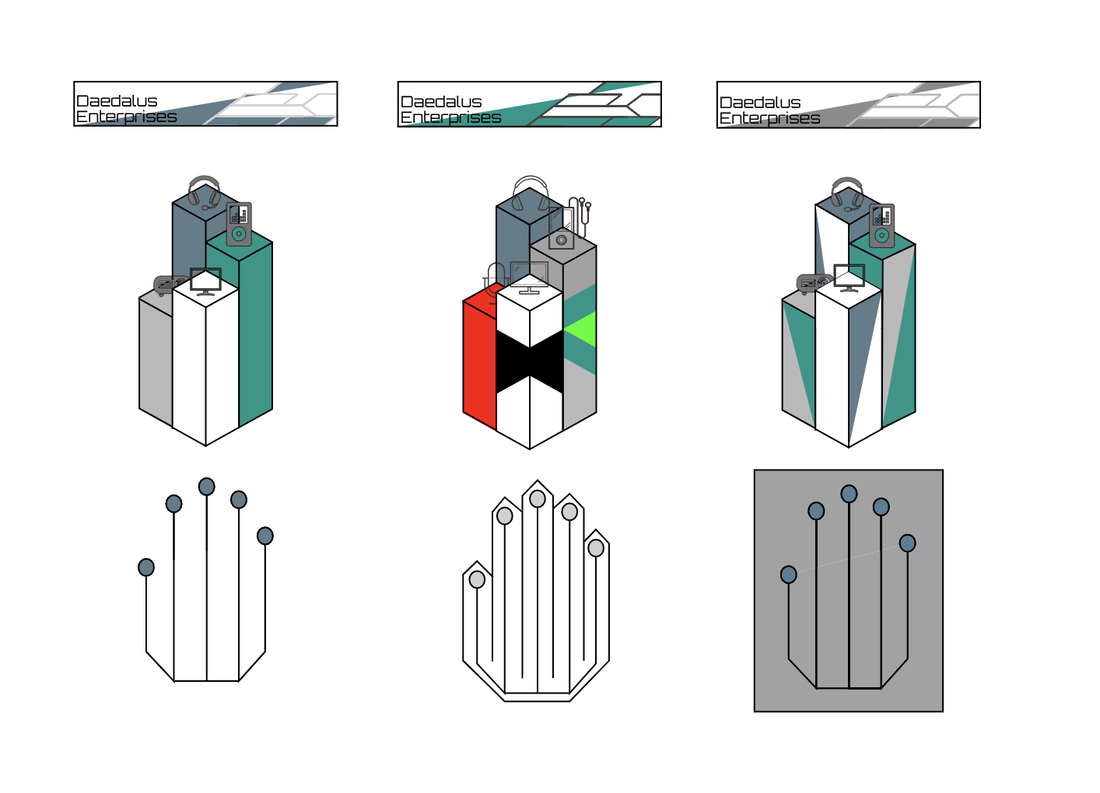 The name of my brand is called Daedalus Enterprises and it is a company that specializes in software and hardware products. I created a logo from its identity by thinking very minimalistic and sharp about its creation, hence the reason why everything looks so geometric and non-organic. Daedalus Enterprises is a company that creates technology. This includes coding operating software and creating hardware products such as phones, headphones and computers. The logo represents Daedalus Enterprises because it is a symbol of improvement, and of constant innovation. The different heights of the pillars represent the rising advancement of technology. The logo which I chose is my favorite out of all of them because it is the most complex and intriguing of them all, while still keeping to the basic style of minimalism. I think that the extra triangles on the sides of the pillars make the design pop out even more by throwing in a bit of a wild card, and I think that creating those triangles was a good idea for the design. 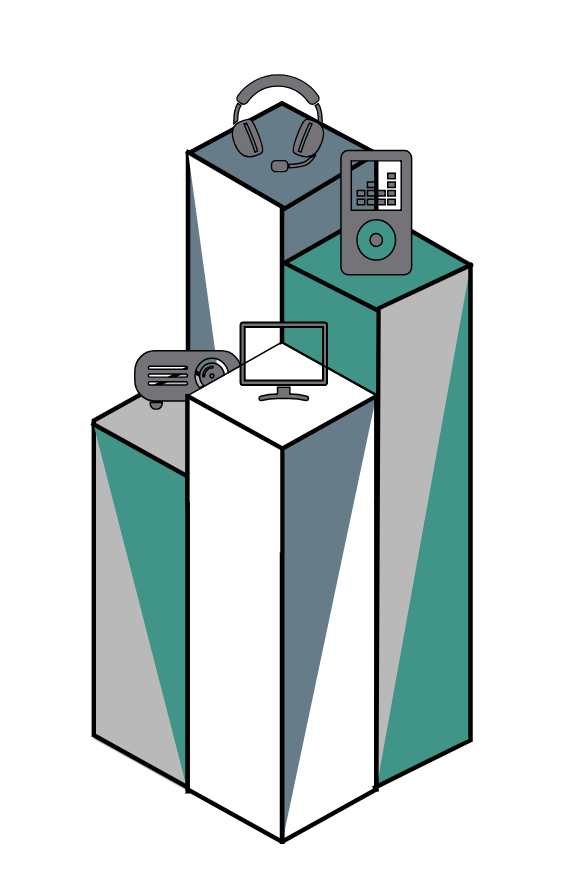 In this assignment, I created many different logos and words which I think represents my brand. For this assignment, I created a company called Daedalus Enterprises. This company is a software company which creates artificial intelligence. When I made the company, what I had in mind was that it would be a minimalistic, modern, and smart company. This is why my logos represent that. My first logo is a hand which looks like a circuit board. It represents the unity of AI and humans in a utopian society. The second one is three stacks progressively getting taller, symbolizing the growth of humanity through AI. The last one is a machine learning network of trial and error, which represents the way AI's learn. I think that all of my logos represent my company's branding very well. 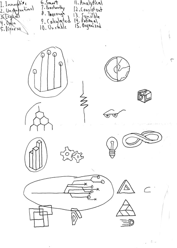 For this assignment, I was tasked with creating 20 shapes, 5 for each of 4 color palette formats. To get my color palettes, I went to the adobe color wheel. I was surprised by just how many different colors and combinations of colors you could have just by selecting a certain palettes. The first format was monochromatic, which is a palette where all colors are a different shade of the same color. The second was analogous which is where all the colors are next to each other on the color wheel. The third palette was triadic, where all colors trisect the middle of the color wheel. The last palette was complementary where there are multiple shades of two colors. Some formats I liked better than others, such as the complementary format, because it only had two general colors which gave it a sense of simplicity. Others I didn't like, like the triadic one. It felt like it was all over the place and had no sense of unity. From this assignment, I learned that there are many colors combinations, but some go better with each other than others. To make these palettes, I used adobe color wheel. 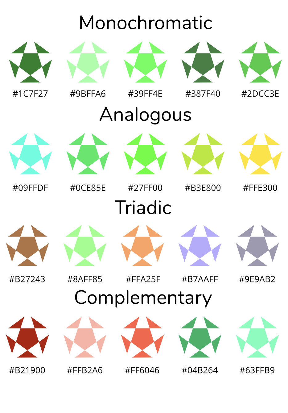 In this unit, we learned about a new aspect of Graphic Design called Color Theory. We learned how computers distinguish and create different colors, which is by using 1's and 0's to create a certain value with a maximum value of 255. We also learned that there are two ways to tell a computer about a color. One, you can use the RGB sequence which goes (255, 255, 255). R stands for red, g stands for green and b is blue. The more of a certain RGB you add into the color, the color starts to look more like that color. So if the green value is high, it will look more green. The other way which I learned was a HEX code which has six color values, two values representing the amount of one RGB. This unit was very important to me because I learned how to tell a computer what color I want, which is a very important aspect of Graphic Design. To demonstrate my knowledge of Color Theory, I created a small illustration with each color labeled with its HEX code and RGB. To create this project, I drew inspiration from a picture from here which I traced with my newly learned pen tool skills and then filled in with various colors. 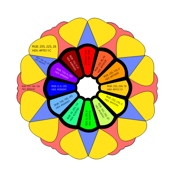 In this unit, we learned about typography which is learning about different fonts and their purposes. Typography is important because it emphasizes what kind of message you are trying to send and the theme of that message. The quote "Each font has a personality and purpose." means that a font can send different messages depending on how it looks. There are actually five different types of fonts. The first is Serif, which are fonts that have "tails" or lines at the end of each stroke. The next is Sans Serif, which is the font I am using right now. It is the most common and efficient type, as it is easy to read and does not stand out too much. The next type is Monospaced which is where each character takes up an equal amount of space. It is mostly used in programming systems because they have many different lines and it is easier to compare the lines. The last two are quite similar. They are handwriting, which is very fancy and looks like cursive. It is mostly used for fancy or formal lettering. The other one is Novelty which contains all the other fonts. They are usually strange fonts which sometimes look like a certain object. They are very thematic and are effective if you want to send a certain message or vibe in your writing. Word PortraitsFor this assignment, I was tasked with finding ten fonts and then finding two words for each font: one which matched the font, and one which did not. This assignment shows just how important fonts are, as they make the reader think of certain things when they see that font. 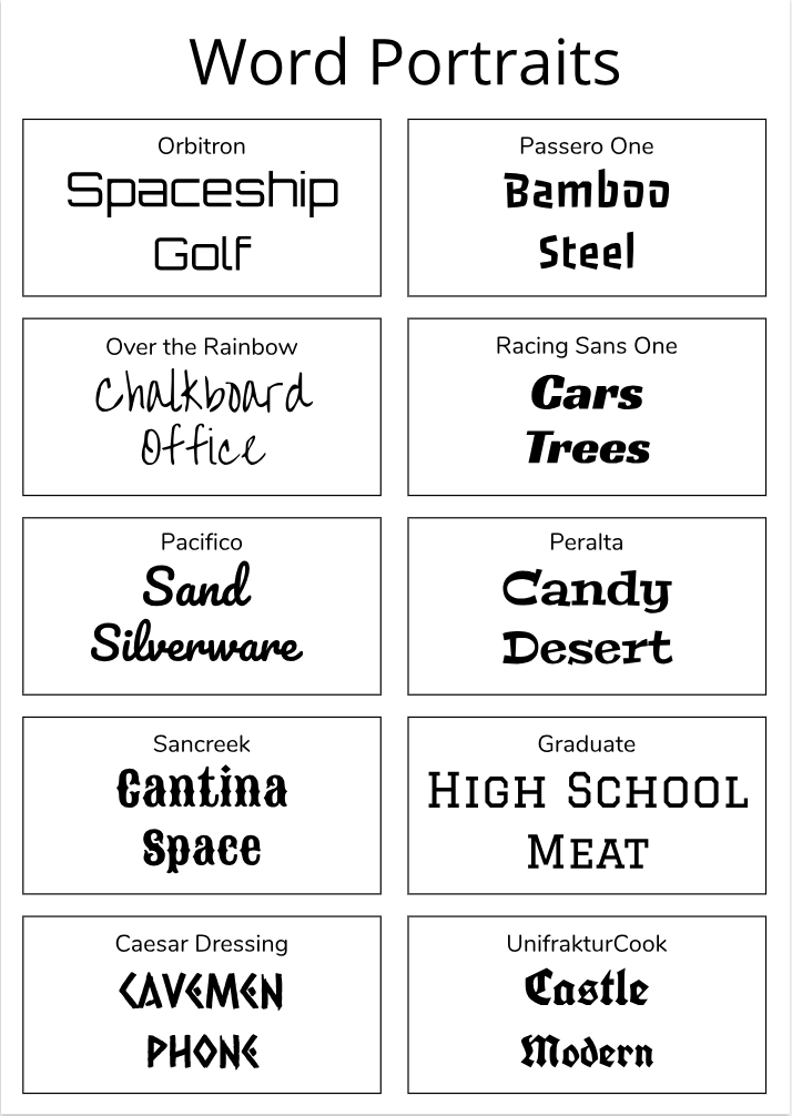 Typeface ComparisonIn this assignment, I demonstrated my knowledge of the different types of fonts by laying them out and showing what they look like. I also learned how important it is to change the sizes of different texts based on their importance, for example, in this assignment, the world itself showing the font is more important than the name of that type of font so it is written larger. 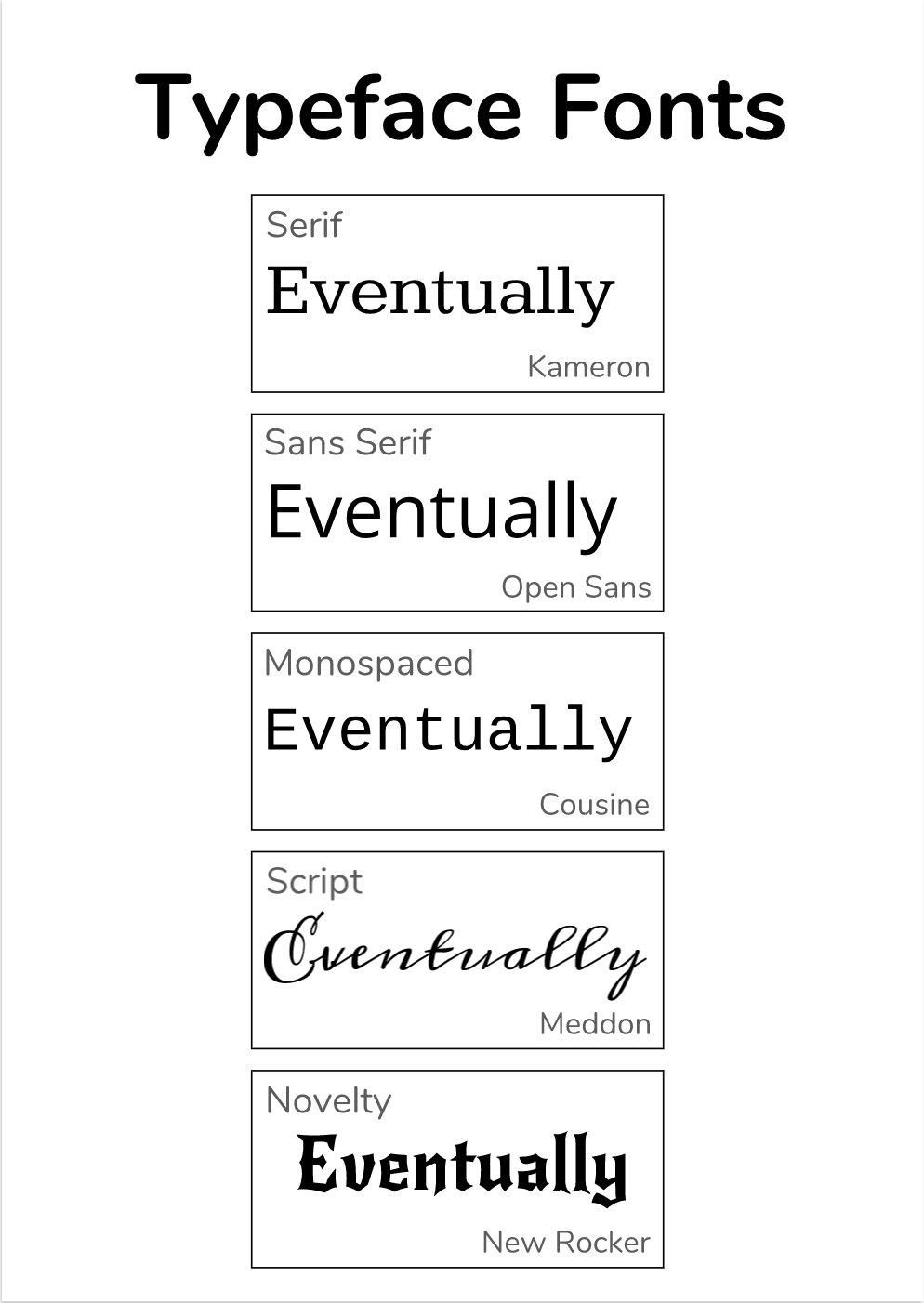 Today I learned about the five different types of fonts or typefaces, which are different ways words are written in real life and digitally. This information was useful to know, because now I know which types of fonts are the best for visuals and which are the most readable. 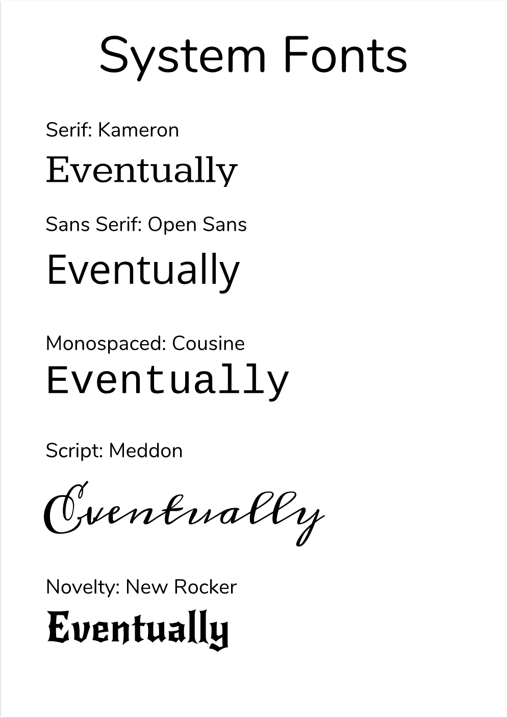 |
Categories
All
Archives
May 2019
 This work is licensed under a Creative Commons Attribution-NonCommercial-ShareAlike 4.0 International License. |
