|
In this part of my logo design process, I vectorized my three logos and made two new variations for each of them. This part of the design process was quite challenging because I had to layer every single layer and polygon properly to make the design look right, which took a long time and I failed a few times. My favorite part about creating the three variations was surprising myself with how I could improve on the logos. I thought that I had already created the ideal logos, but I managed to do better. Something that I learned from this experience is that creating variations, or any type of creative modification to your original design can give you new ideas without you even knowing it, so always throw in something extra just in case it might improve your design. 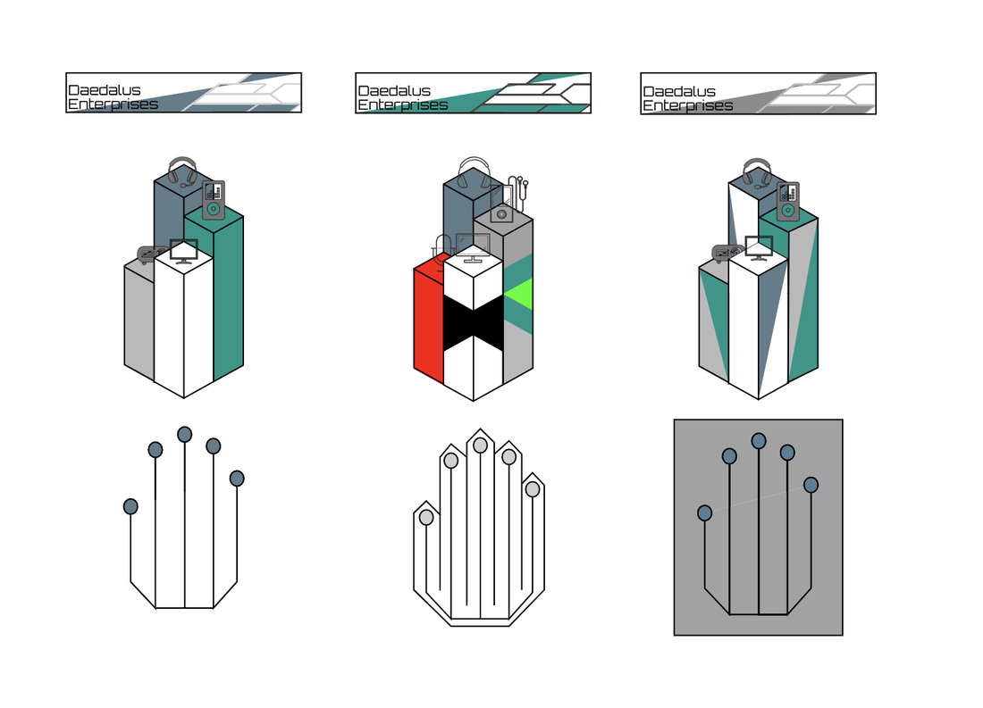 The name of my brand is called Daedalus Enterprises and it is a company that specializes in software and hardware products. I created a logo from its identity by thinking very minimalistic and sharp about its creation, hence the reason why everything looks so geometric and non-organic. Daedalus Enterprises is a company that creates technology. This includes coding operating software and creating hardware products such as phones, headphones and computers. The logo represents Daedalus Enterprises because it is a symbol of improvement, and of constant innovation. The different heights of the pillars represent the rising advancement of technology. The logo which I chose is my favorite out of all of them because it is the most complex and intriguing of them all, while still keeping to the basic style of minimalism. I think that the extra triangles on the sides of the pillars make the design pop out even more by throwing in a bit of a wild card, and I think that creating those triangles was a good idea for the design. 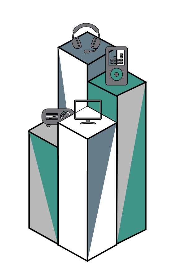
0 Comments
Leave a Reply. |
Categories
All
Archives
May 2019
 This work is licensed under a Creative Commons Attribution-NonCommercial-ShareAlike 4.0 International License. |
